
Carlos Courtney
Strategy
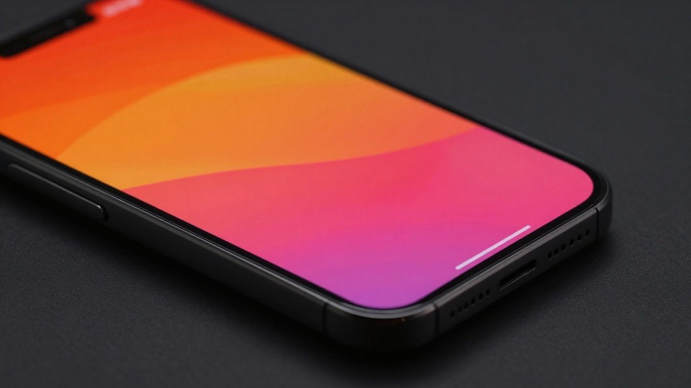
Mobile Friendly Content: Designs That Perform on Small Screens

So, you've got a website, and you want people to actually be able to use it on their phones, right? That's where making your content mobile-friendly comes in. It's not just about making things smaller; it's about rethinking how people interact with your stuff when they're not sitting at a big computer. Google's even paying attention to this, so if your site isn't playing nice with phones, you might get lost in the shuffle. Let's break down how to make your content shine on those smaller screens.
Key Takeaways
When designing for phones, keep things super clear and easy to use. Think about how people actually use their phones – often when they're busy or on the go.
Layouts that stack content in a single column and have big, easy-to-tap buttons are a must. Simple menus, like the 'hamburger' kind, also help a lot.
Make your website load fast. This means shrinking images and not going overboard with fancy animations or big graphics that bog things down.
Design with touch in mind. Buttons and links should be big enough to tap without hitting the wrong thing by accident. Clear calls to action guide users.
Always test your site on actual phones and tablets. What looks good on a computer might be a mess on a smaller screen. Also, avoid annoying pop-ups that get in the way.
Designing For Mobile-Friendly Content
Prioritize Clarity and Ease of Use
When folks are looking at your website on their phones, they're usually not sitting down for a long read. They might be on the go, trying to find something fast, or juggling a few things at once. This means your content needs to be super clear and simple to get through. Think about it: have you ever tapped a hamburger menu that just didn't work, or tried to hit a button that was way too small? It's frustrating, right? Mobile users skim more than they read deeply, so getting your main points across quickly is key. Make sure the most important stuff is right there, easy to see and understand, without making them hunt for it.
Understand User Context on Mobile
People use their phones differently than they use their computers. They're often multitasking, looking for quick answers, or just browsing while waiting for something. This context matters a lot when you're designing your content. You can't just shrink down a desktop page and expect it to work. You have to think about what someone might be trying to do right now on their phone. Are they looking for directions? A phone number? A quick product overview? Tailor your content to fit those immediate needs. It's about meeting them where they are, with what they need, at that moment.
Embrace Mobile-First Indexing
Google and other search engines now look at the mobile version of your website first when they're deciding how to rank it. This is called mobile-first indexing. So, if your mobile site isn't up to par, your search rankings could take a hit. It's not just about having a mobile version; it's about making sure that mobile version is really good. This means prioritizing content and design for smaller screens from the get-go. It's a bit like building a house starting with the most important rooms first, rather than trying to cram everything into a small space later. Focusing on mobile-friendly content means your site will be found more easily by people searching on their phones, which is most people these days.
Key Features Of Mobile Website Design
When folks are on their phones, they're usually not sitting down with a cup of coffee and reading a novel. They're often on the go, trying to find something fast, or maybe just killing a few minutes. This means your website needs to be super easy to use and understand right away. It's not just about shrinking things down; it's about rethinking how people interact with your content on a small screen. Good mobile design prioritizes clarity and makes it simple for users to get what they need without fuss.
Vertical Display And Single Column Layouts
Think about how you naturally hold your phone – vertically. Websites designed for mobile should follow suit. This means stacking content in a single column. It's like reading a book, but you just keep scrolling down. This layout makes it easy to scan information without having to move your finger all over the screen. It also helps keep your content organized and prevents things from getting jumbled up. You'll see this a lot in apps and well-designed mobile sites because it just works.
Large, Clearly Labeled Buttons
Ever tried to tap a tiny button on your phone and ended up clicking something else? It's frustrating! Mobile websites need buttons that are big enough to tap easily with a finger. They should also have clear labels so people know exactly what they're clicking. Think about using colors that stand out from the rest of your page to draw attention. This makes it much simpler for users to move around your site and complete actions, like making a purchase or signing up for a newsletter.
Simplified Navigation With Hamburger Menus
Space is tight on mobile screens, so designers often use what's called a "hamburger menu." It's that little icon with three horizontal lines that, when tapped, opens up a list of navigation options. This keeps the main page looking clean and uncluttered. Just make sure the menu itself is easy to understand and doesn't have too much text. A well-implemented hamburger menu can help users find pages quickly without overwhelming the display.
Readable Fonts And Concise Text
Nobody wants to squint at their phone trying to read tiny text. Choose fonts that are easy to read on a small screen, and make sure the text is big enough. Also, get straight to the point. Mobile users tend to skim, so keep your sentences short and your paragraphs brief. Break up longer pieces of text with headings, bullet points, or even different background colors to make them easier to digest. It's all about making the information accessible and quick to understand.
Optimizing Performance For Small Screens
When folks are browsing on their phones, they usually want things to happen fast. Nobody likes waiting around for a page to load, especially when they're on the go. So, making sure your site is zippy is a big deal.
Streamline Load Times With Image Optimization
Images can really slow things down if they're not handled right. Think about it – a huge, high-resolution photo might look great on a big monitor, but on a phone, it's just overkill and takes ages to download. You'll want to shrink those image files without making them look all blocky. Using the right file types helps too. For photos, JPEG is usually a good bet, and for graphics with see-through bits, PNG is the way to go. It's all about finding that sweet spot between quality and file size.
Minimize Animations For Better Performance
Animations can be cool, they really can. But on a small screen, too much movement can be distracting and, more importantly, drain battery life and processing power. Mobile devices just aren't as beefy as desktops. So, if you're thinking about adding some flair with animations, be really picky. Every animation should have a clear purpose. Is it helping the user understand something, or is it just there to look pretty? If it's the latter, you might want to skip it or find a simpler way to show it.
Avoid Large, Complex Graphics
Similar to images, really big, complicated graphics can be a performance killer on mobile. These might be intricate illustrations or detailed charts that require a lot of data to load and render. On a small screen, these can also be hard to see and interact with anyway. It's better to stick to simpler visuals that load quickly and are easy to grasp at a glance. If you have complex data, consider presenting it in a more digestible format, perhaps through a series of smaller graphics or even a link to a more detailed report that users can choose to view if they wish.
Enhancing User Experience On Mobile
Making a website work well on a phone isn't just about shrinking things down. It's about making it genuinely pleasant and easy for someone to use while they're out and about, maybe with one hand, or trying to find something fast. We want people to feel good using our sites, not frustrated.
Incorporate Touch-Friendly Elements
Think about how people actually use their phones. They're tapping with their fingers, not clicking with a precise mouse. This means buttons and links need to be big enough to hit without accidentally tapping something else. We're talking about touch targets that are at least 44 pixels by 44 pixels, with a bit of space around them. It stops those annoying "oops, wrong button" moments. Clear calls to action, like "Buy Now" or "Learn More," should be right there, obvious and easy to tap. No one wants to hunt for the next step.
Implement Clear Calls to Action
When someone lands on your page, they should know exactly what you want them to do next. Don't make them guess. Your main calls to action (CTAs) should be prominent and placed where they're easy to spot, usually near the top of the content. Using contrasting colors for these buttons helps them stand out. It's like a friendly signpost saying, "This way to what you're looking for!"
Provide a 'Back to Top' Button
Mobile pages can get pretty long, right? Scrolling up and down endlessly is a pain. A simple "Back to Top" button, often tucked away in a corner, makes a huge difference. It lets users jump right back to the start of the page with a single tap. This is especially helpful on articles or long product pages, saving people time and effort.
Link Logo to Homepage for Familiar Navigation
This one's a classic for a reason. When users see a logo, especially on mobile where menus can be hidden, they expect it to take them back to the main page. It's a standard convention that people are used to. Having your logo act as a reliable shortcut back home provides a sense of comfort and makes it easy for users to reset their journey on your site if they get lost or just want to start over.
Ensuring Accessibility In Mobile Design
Utilize Strong Color Contrast
Making sure your colors pop, but not in a bad way, is super important for mobile. People are looking at these tiny screens in all sorts of lighting, from bright sun to dim rooms. If your text blends into the background, it's a no-go. Aim for a good difference between your text and its background. This isn't just about making things look nice; it helps folks with visual impairments read your content without a struggle. Think about using tools that check your contrast ratios – they're pretty handy.
Choose Readable And Scalable Fonts
When you pick fonts for your mobile site, think about what looks good on a small screen and what's easy to read. Fonts like Roboto, Inter, or Montserrat are often good choices because they're clean and don't have too many fancy bits that get lost when shrunk down. Plus, you want your text to be able to grow if someone needs it to. Making sure users can adjust font sizes without breaking your layout is a big win for accessibility.
Add Alt Text For Images
Images are great, but what about people who can't see them? That's where alt text comes in. It's a short description that screen readers can read aloud, telling users what the image is about. This simple step makes your content understandable for everyone, regardless of their vision. Don't just put "image" as the alt text; be descriptive! If it's a picture of a dog, say "A golden retriever playing fetch in a park."
Ensure Keyboard-Friendly Navigation
Not everyone uses a mouse or a touchscreen. Some people rely on keyboards or other assistive devices to get around websites. This means that every button, link, and form field on your site needs to be reachable and usable with just a keyboard. You should be able to tab through your content in a logical order and activate elements using the Enter or Spacebar keys. It takes a bit of testing, but it opens up your site to a much wider audience.
Making your mobile site accessible isn't just a nice-to-have; it's a must-have. It means thinking about users with different needs from the very start of your design process. Simple choices in color, font, and how you describe images can make a huge difference in whether someone can actually use your site or not. It's about being inclusive and making sure your content is for everybody.
Best Practices For Mobile-Friendly Content
When you're building content for the web today, you really have to think about how it's going to look on a phone. Most people are browsing on their phones, after all. So, making sure your site works well on a small screen isn't just a nice-to-have; it's pretty much a requirement. This means adopting a responsive design approach is key. It’s about making your website adjust automatically to whatever screen size someone is using, whether that’s a tiny phone or a big desktop monitor. This way, people don't have to pinch and zoom all the time, which is super annoying.
Adopt A Responsive Design Approach
Responsive design is the standard way to go. It's not just about making things smaller; it's about rearranging content so it makes sense on a smaller screen. Think about how you'd present information if you only had a few inches to work with. You'd probably put the most important stuff front and center, right? That's the idea here. It means your layout might change quite a bit from a desktop view to a mobile view, but the goal is always to keep things clear and easy to use. This approach helps make sure your content is accessible and looks good no matter what device someone is using to view it. It's all about creating a consistent experience for everyone.
Test Designs On Real Devices
Look, reading about how to make things mobile-friendly is one thing, but actually seeing it in action on a phone is another. You really need to test your designs on actual devices. What looks good on your big monitor might be a total mess on a smartphone. You want to tap buttons to see if they're big enough, scroll through pages to check the flow, and make sure text is readable without squinting. It's the best way to catch those little annoyances that users will definitely notice. Don't just rely on simulators; get a few different phones and tablets and try them out.
Avoid Intrusive Pop-Ups
Pop-ups can be a real pain on mobile. They often cover up the content you're trying to see, and they can be really hard to close with a finger. If you absolutely need to use a pop-up, make sure it's small, easy to dismiss, and doesn't block the main content. A lot of times, it's better to find a less disruptive way to get your message across on a smaller screen. Think about other ways to guide users, like clear calls to action within the content itself, rather than interrupting their experience with a big, unwanted box.
Making your website work well on phones is super important these days. People use their phones for everything, so you want to make sure your content looks good and is easy to read on smaller screens. This means using clear layouts and simple text. Want to learn more about making your site phone-friendly? Visit our website for tips and tricks!
Wrapping It Up
So, making your website work well on phones isn't just a nice-to-have anymore, it's pretty much a must. We've talked about how important it is to keep things simple, make sure text is easy to read, and that buttons are big enough to actually tap. Loading times matter a lot too – nobody likes waiting around for a page to load when they're out and about. By paying attention to these details, like using clear navigation and making sure your images aren't slowing things down, you're going to make things a lot easier for your visitors. It really comes down to making sure everyone has a good experience, no matter what device they're using to check you out.
Frequently Asked Questions
What does 'mobile-friendly' mean for a website?
A mobile-friendly website is one that looks and works great on phones and tablets. It automatically adjusts its size so you don't have to pinch or zoom to see things. Buttons are big enough to tap with your finger, and text is easy to read without squinting.
Why is designing for mobile so important now?
Most people use their phones to browse the internet these days. Google even checks your mobile site first when deciding where to put you in search results. If your site isn't easy to use on a phone, people might leave, and it could hurt your chances of being found online.
What's the 'mobile-first' approach to design?
It means you start by designing for the smallest screen (like a phone) first. Then, you add more details or features as you design for bigger screens like tablets and computers. This way, you make sure the most important stuff is always easy to see and use, no matter the device.
How can I make my website load faster on phones?
To make your site speedy, try making your images smaller without losing too much quality. Also, don't use too many fancy animations, as they can slow things down. Keeping your website simple helps it load much quicker.
What are 'touch-friendly elements'?
These are things like buttons and links that are big enough and spaced out enough so you can tap them easily with your finger without accidentally hitting something else. Clear instructions, like 'Click Here,' also help guide you.
Should I use pop-ups on my mobile site?
It's usually best to avoid pop-ups on mobile. They can be annoying and block the content you're trying to see. There are better ways to share information, like using banners or messages right on the page, that don't get in the way.


